Got a story to tell?
Film. Television. Publishing. Broadway. Live entertainment.
The industry doesn't matter. You have a story to tell?
Behind the Work
From Concept to Execution: The thinking behind select campaigns.
PARAMOUNT +
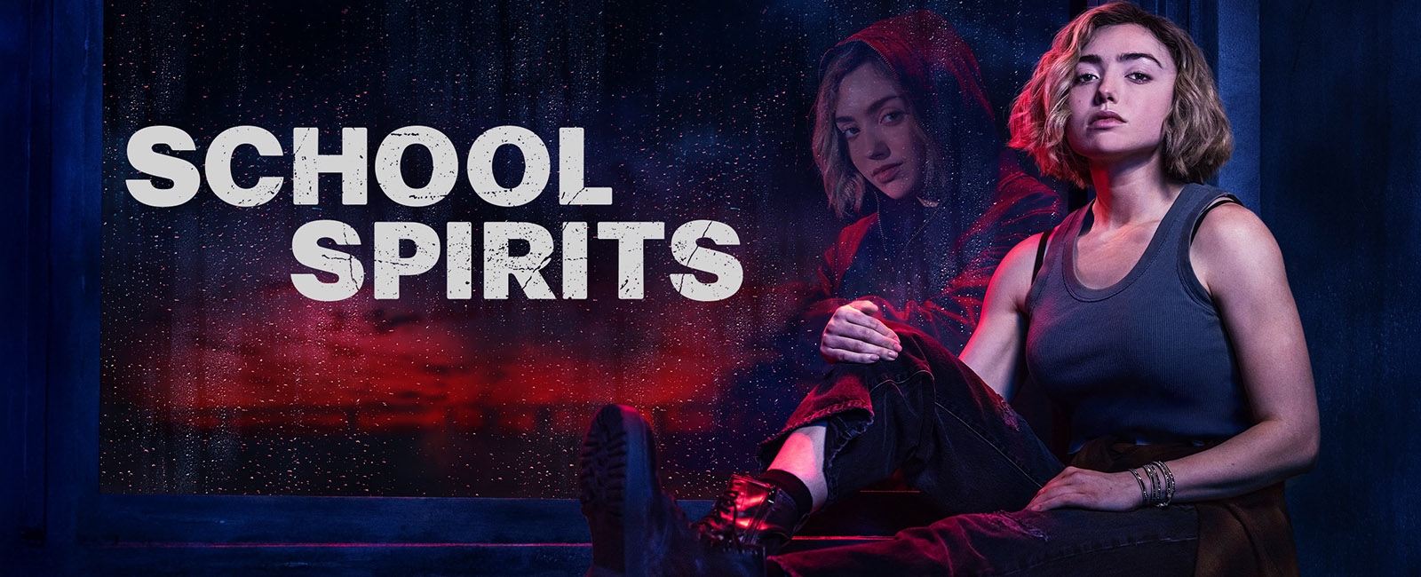
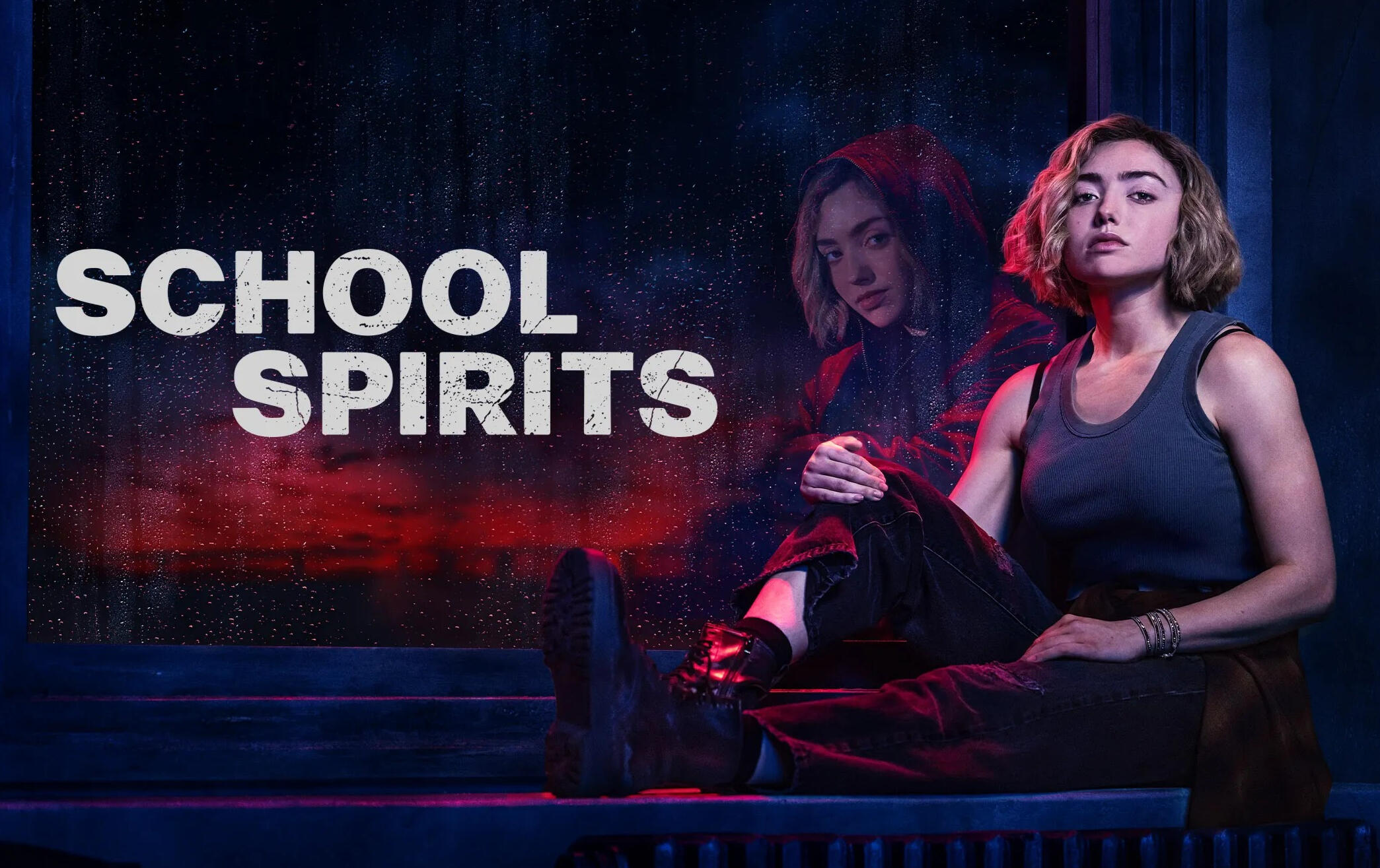
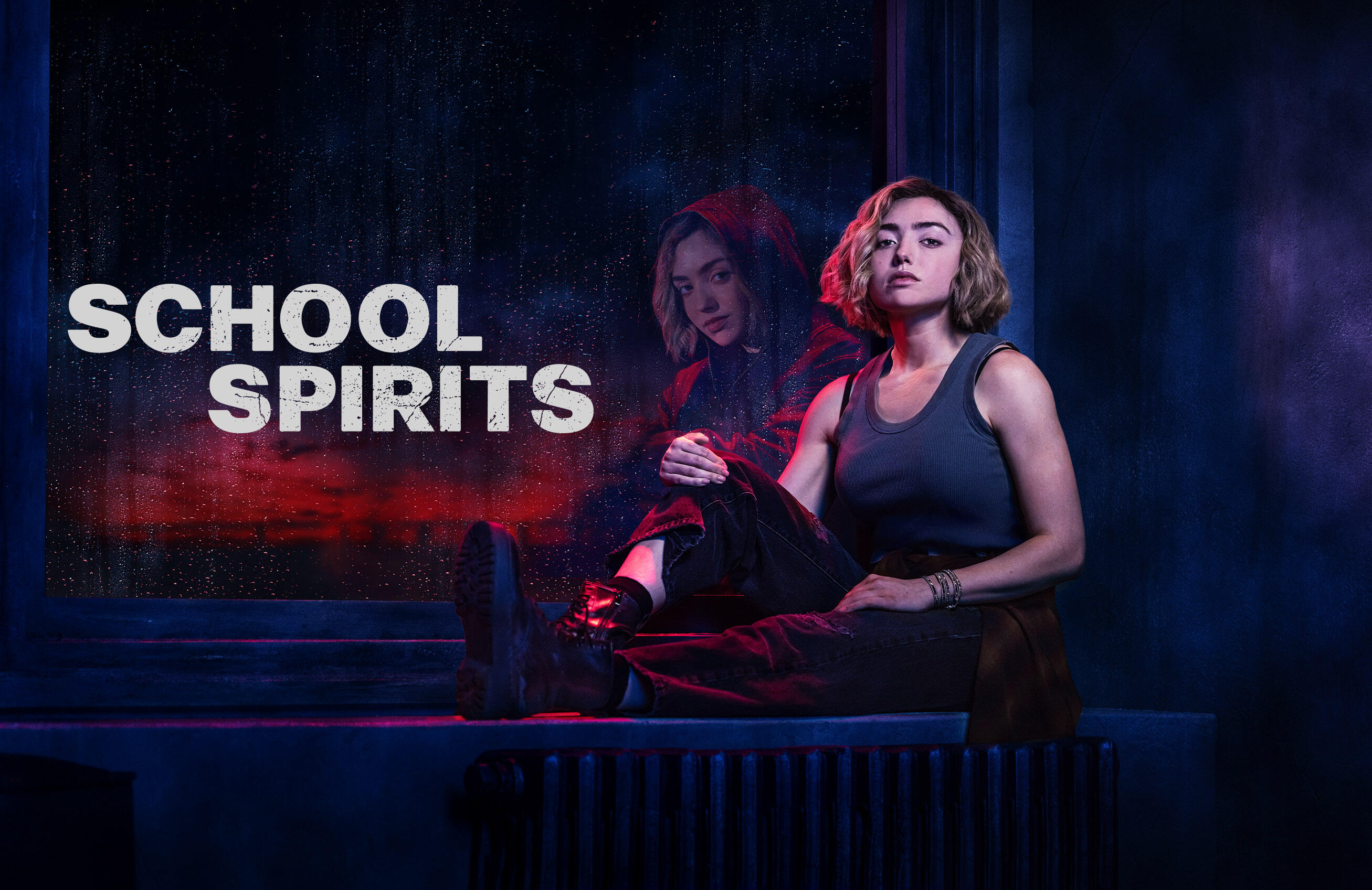
School Spirits
CAMPAIGN CREATIVE - ART DIRECTION - SET DESIGN
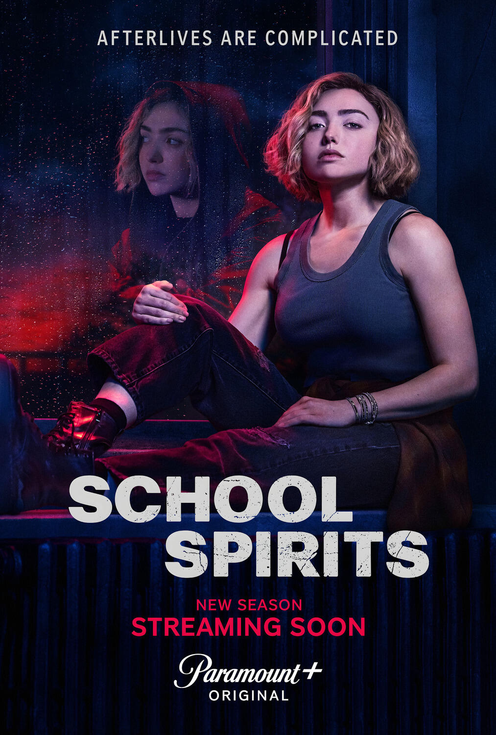
A protagonist split between two worlds ; the girl who disappeared and the spirit
who took her place. One visually arresting image to hold both truths.
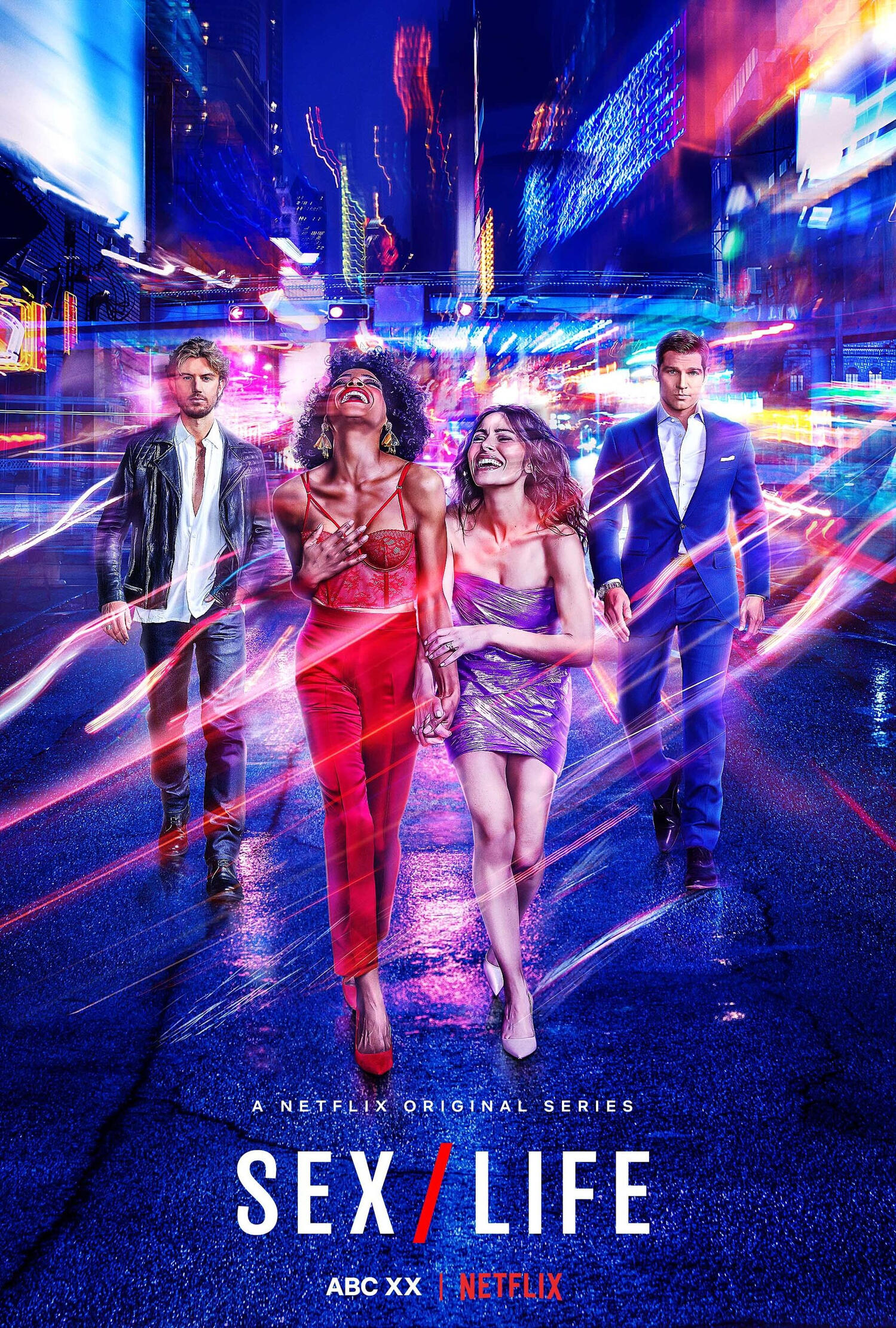
HULU
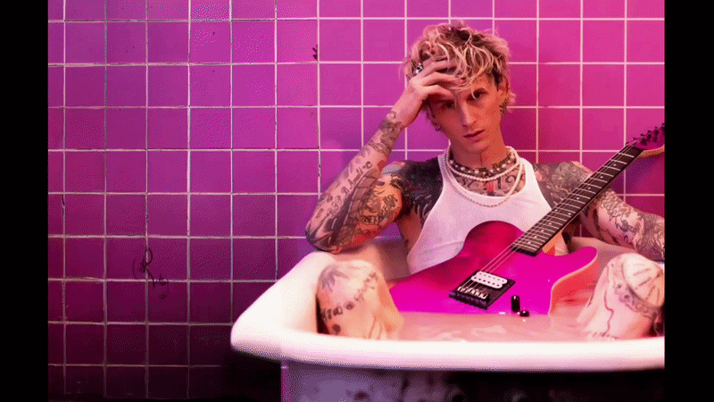
Machine Gun Kelly:
Life in Pink
CAMPAIGN CREATIVE - ART DIRECTION - CONCEPT DEVELOPMENT
MGK's image is built on a bad boy persona. The brief asked for something different; access to a side of MGK never before seen.
Featured Work
Senior Art Director · Print Advertising · Campaign Creative
PARAMOUNT+
School Spirits S2
CAMPAIGN CREATIVE - ART DIRECTION - SET DESIGN
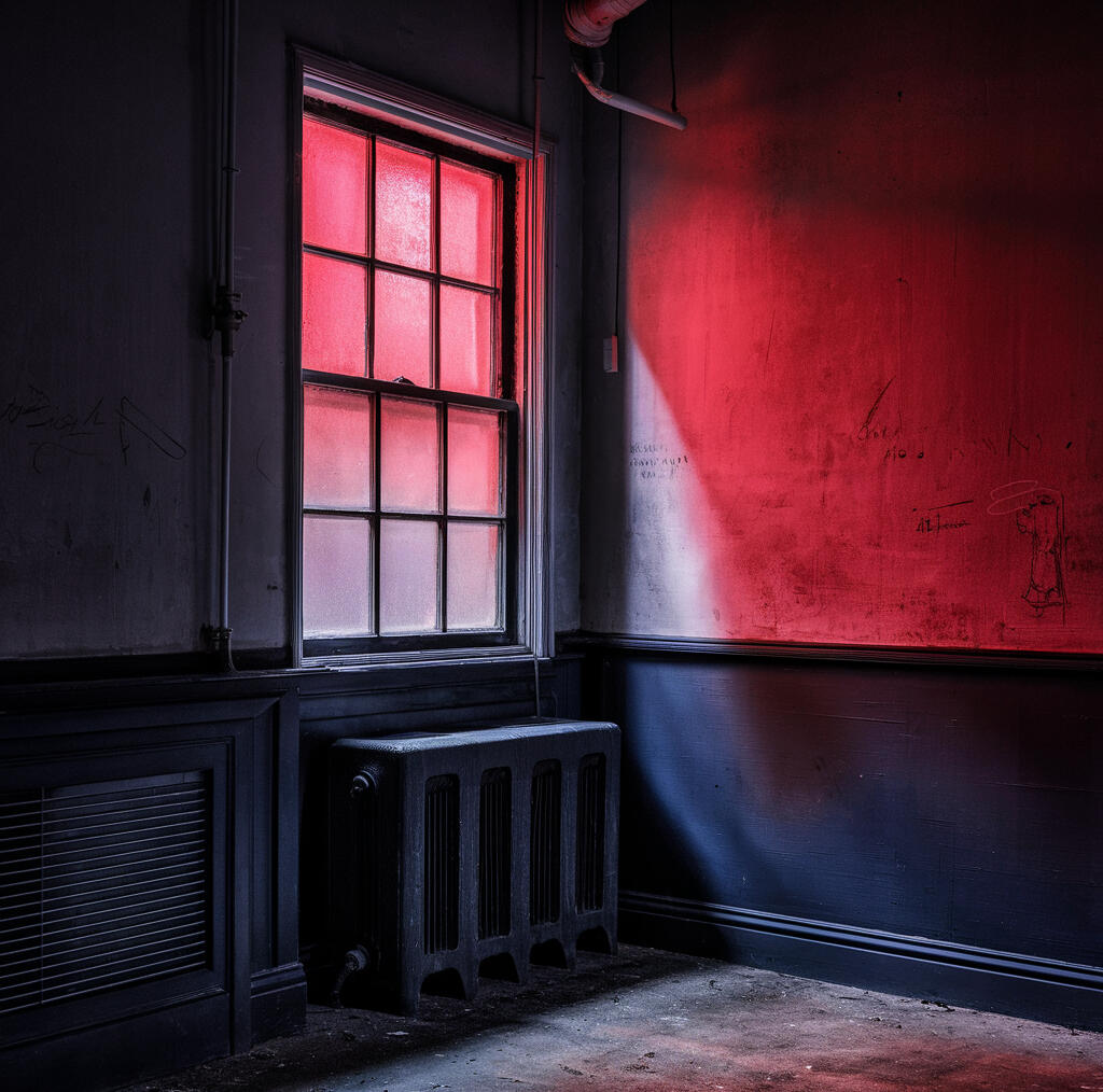
THE CHALLENGE
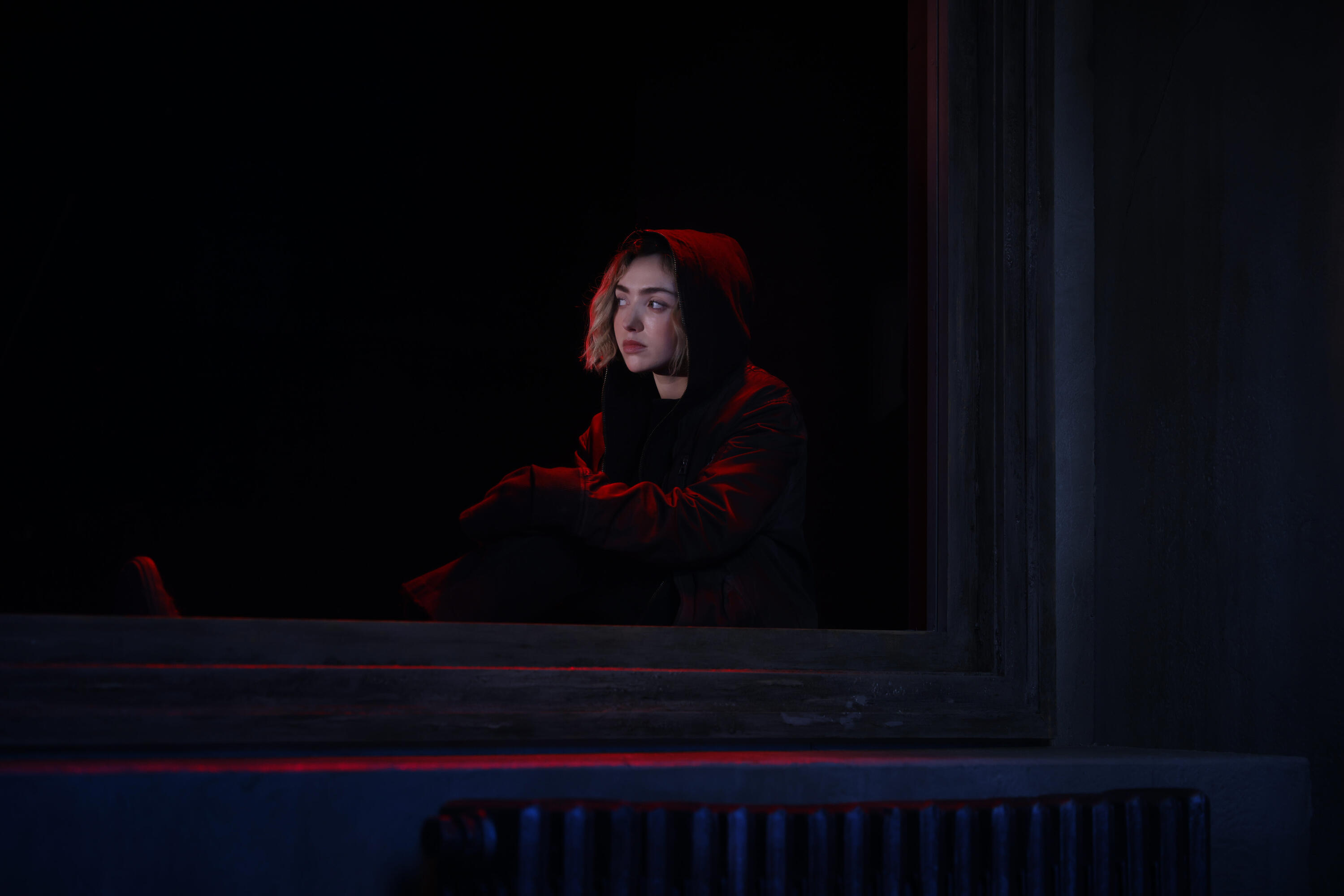
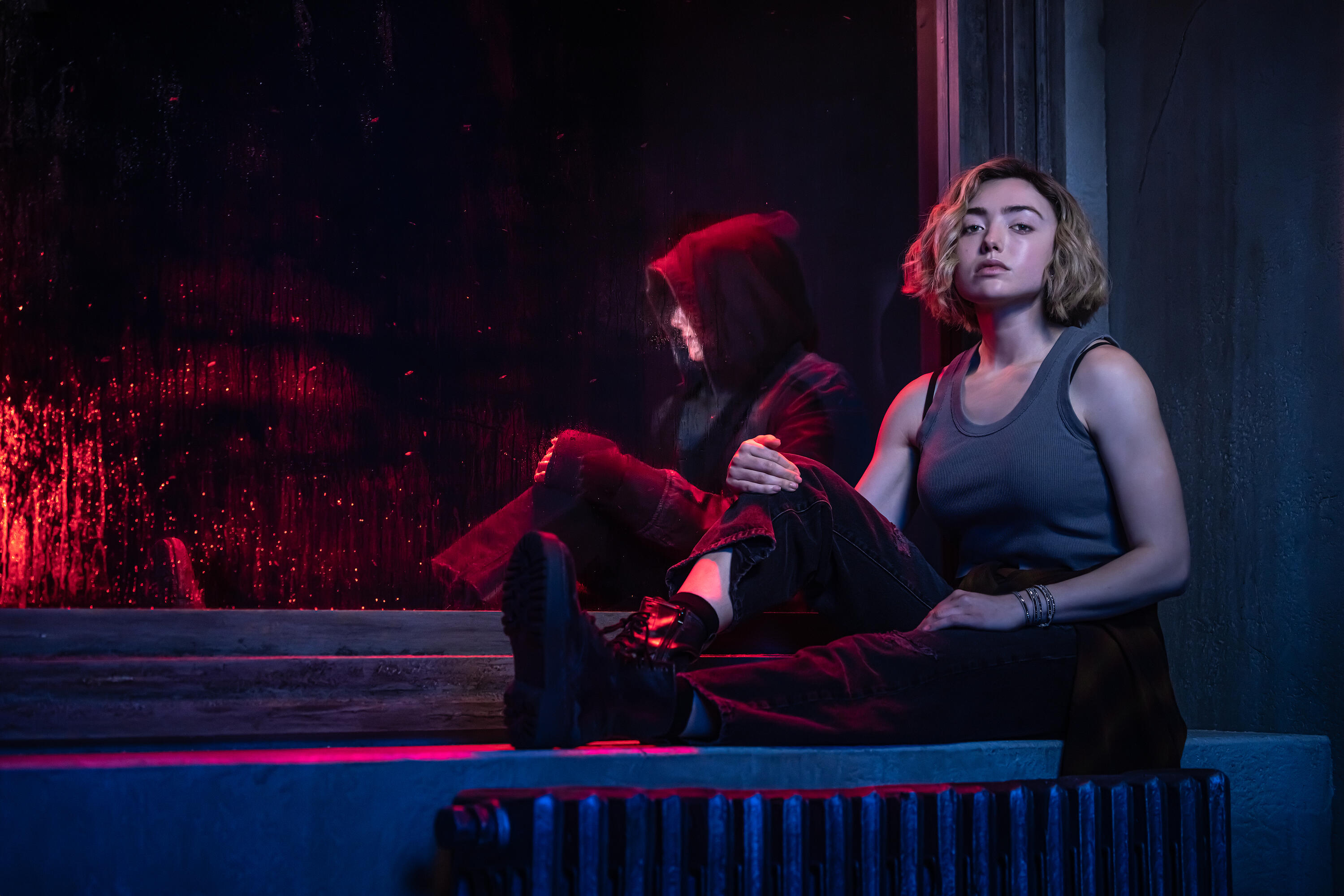
School Spirits needed campaign imagery that could hold two realities; the world of the living and the world of the dead, without tipping too far into horror or losing the elevated YA tone the show required.The central creative problem was Maddie herself: a protagonist split between the girl who disappeared and the spirit who stole her body.
WHAT MADE IT DIFFERENT
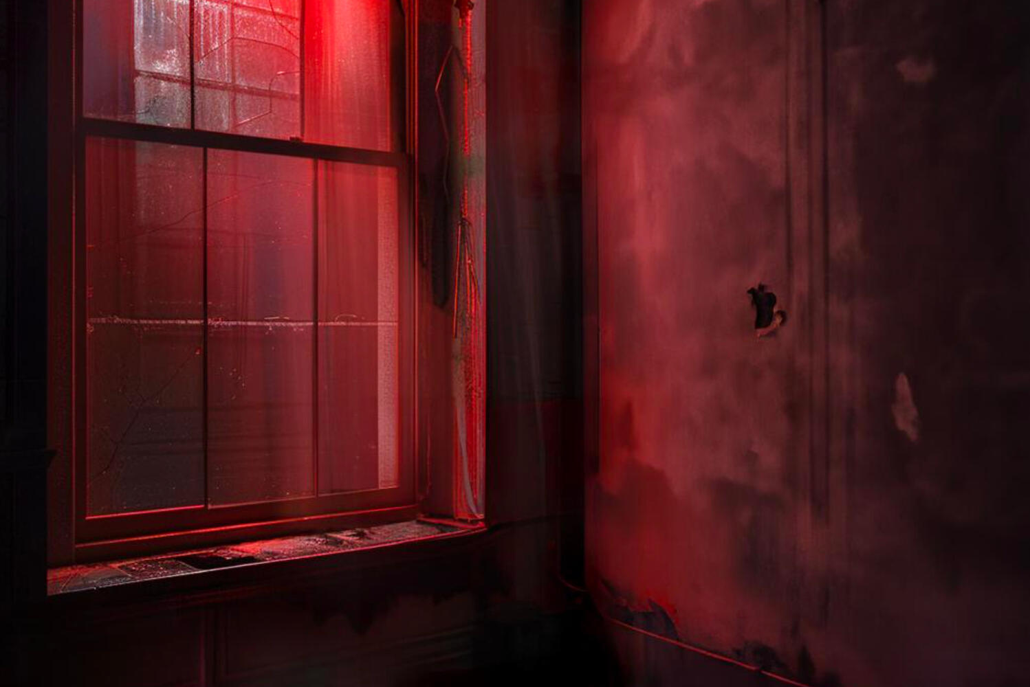
Every element in frame was a decision rooted in who Maddie is and what's been done to her. She sits on an old furnace, now cold. The walls around her rough and slightly neglected, a corner of the school nobody tends to anymore because nobody's supposed to be there.The red light bleeding through the window, the rear light on the cars of Students leaving, going home, moving on with lives she can't touch. The light crosses her face and keeps going. She doesn't get to follow.Paramount built the world from the concept art a real physical set, constructed before a single frame was shot. Because the environment was real, the image carries a weight you can feel rather than just see.
"Reflected car tail lights bleed across the window in moody red tones, heightening the unease and reinforcing the sense that danger is always just outside; watching, waiting."
THE APPROACH
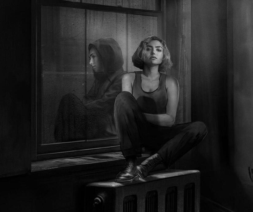
The concept was duality , a single image carrying both versions of Maddie without making her look like her own twin. The seam between the living and the dead dissolved through retouching and image assembly.The environment needed to do as much work as the talent. Concept art defined the lighting, the space, the atmosphere and became the brief for a practical set build. Paramount constructed it from the ground up before a single frame was shot.
MOOD AND LIGHTING REFERENCES ESTABLISHED THE VISUAL WORLD , AESTHETIC, LIGHTING AND THE ENVIRONMENT
PLATES - ON SET
SET DESIGN - PRODUCTION RENDERS
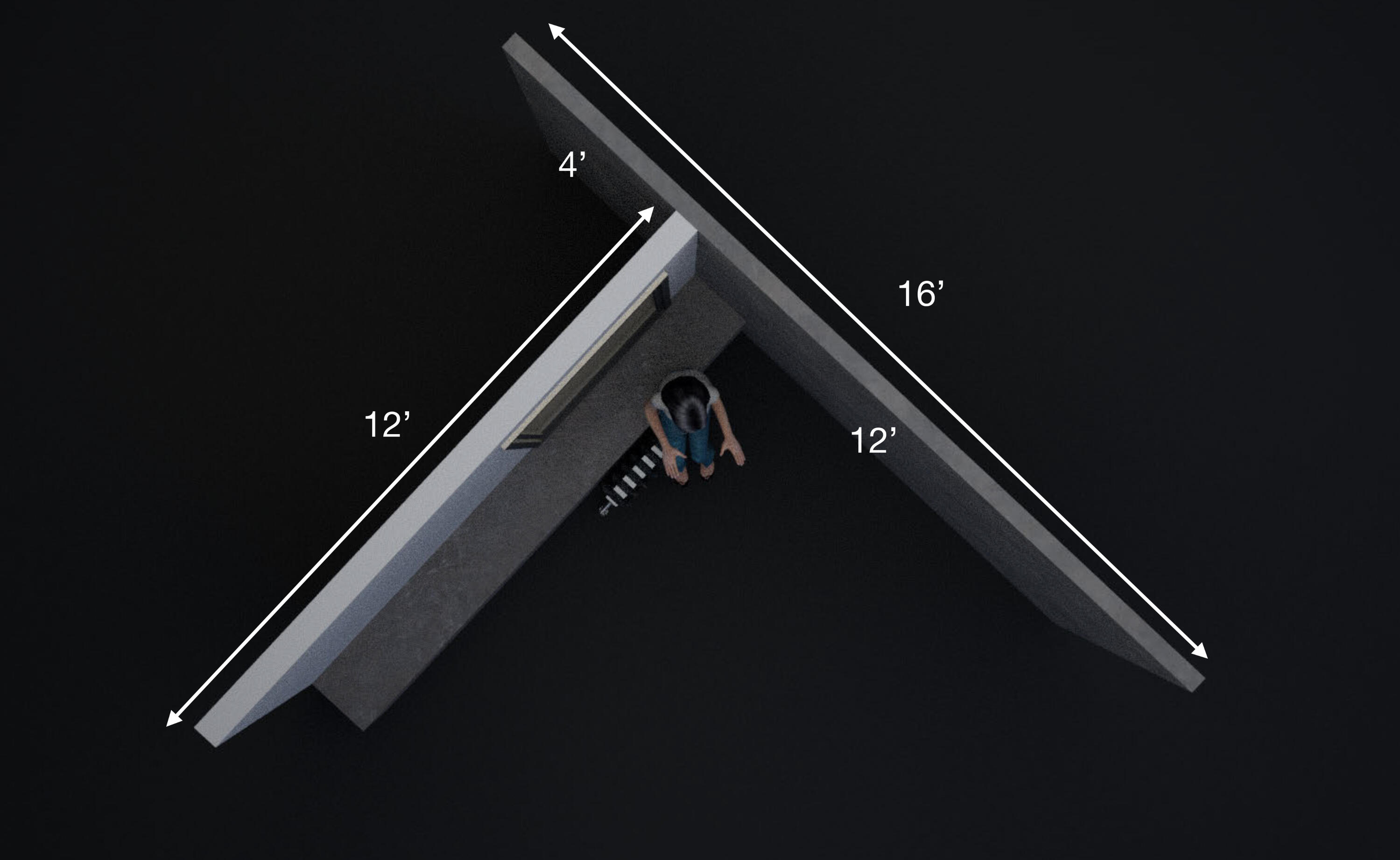
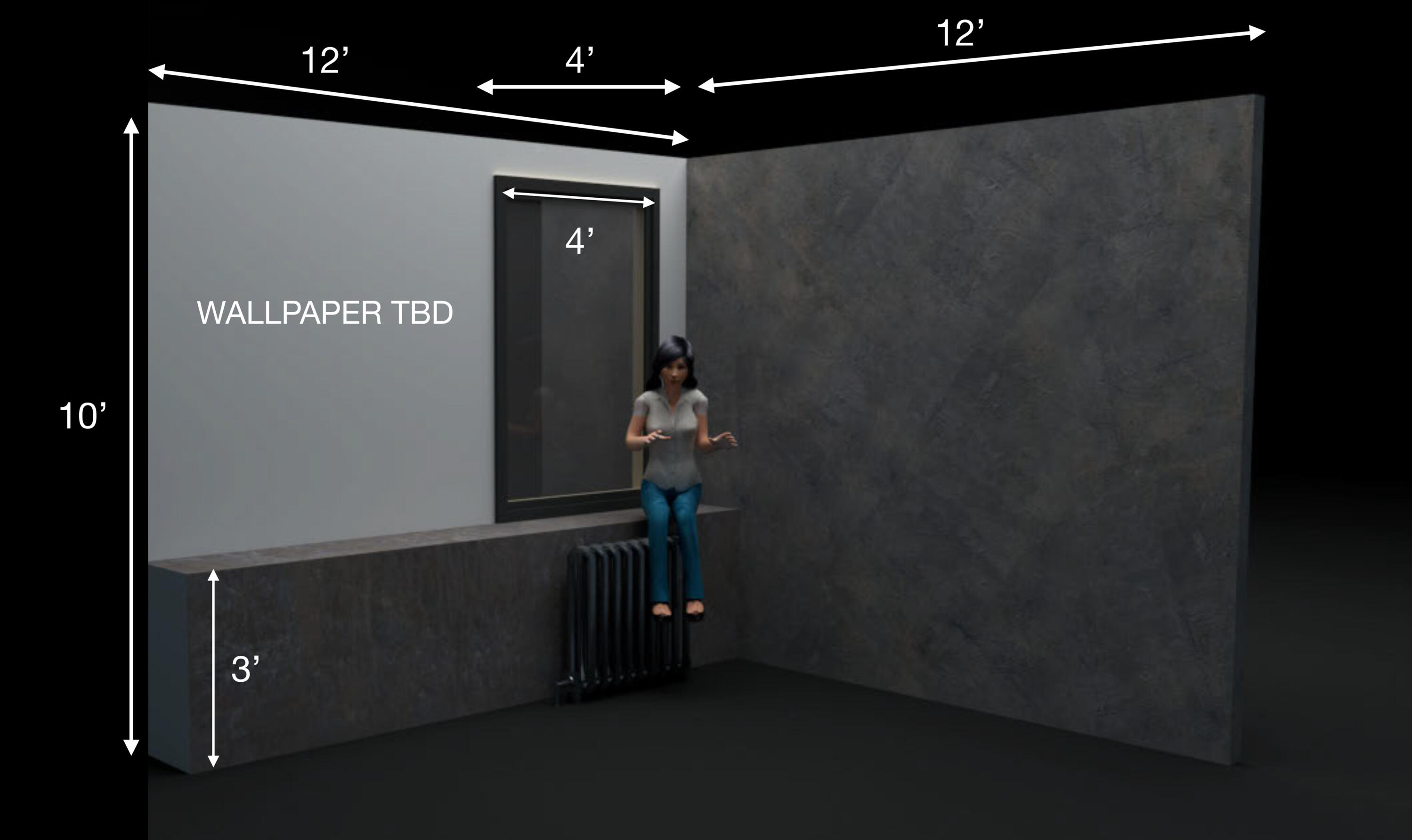
*SET BUILT AND SHOT ON PRACTICAL SET BY ITC, CREATIVE DIRECTION AND CONCEPT ART BY RACHEL SINER
THE RESULT
A campaign image that feels grounded and cinematic. The duality of the show's premise is embedded in every visual choice from the ground up.
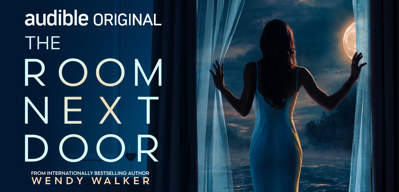
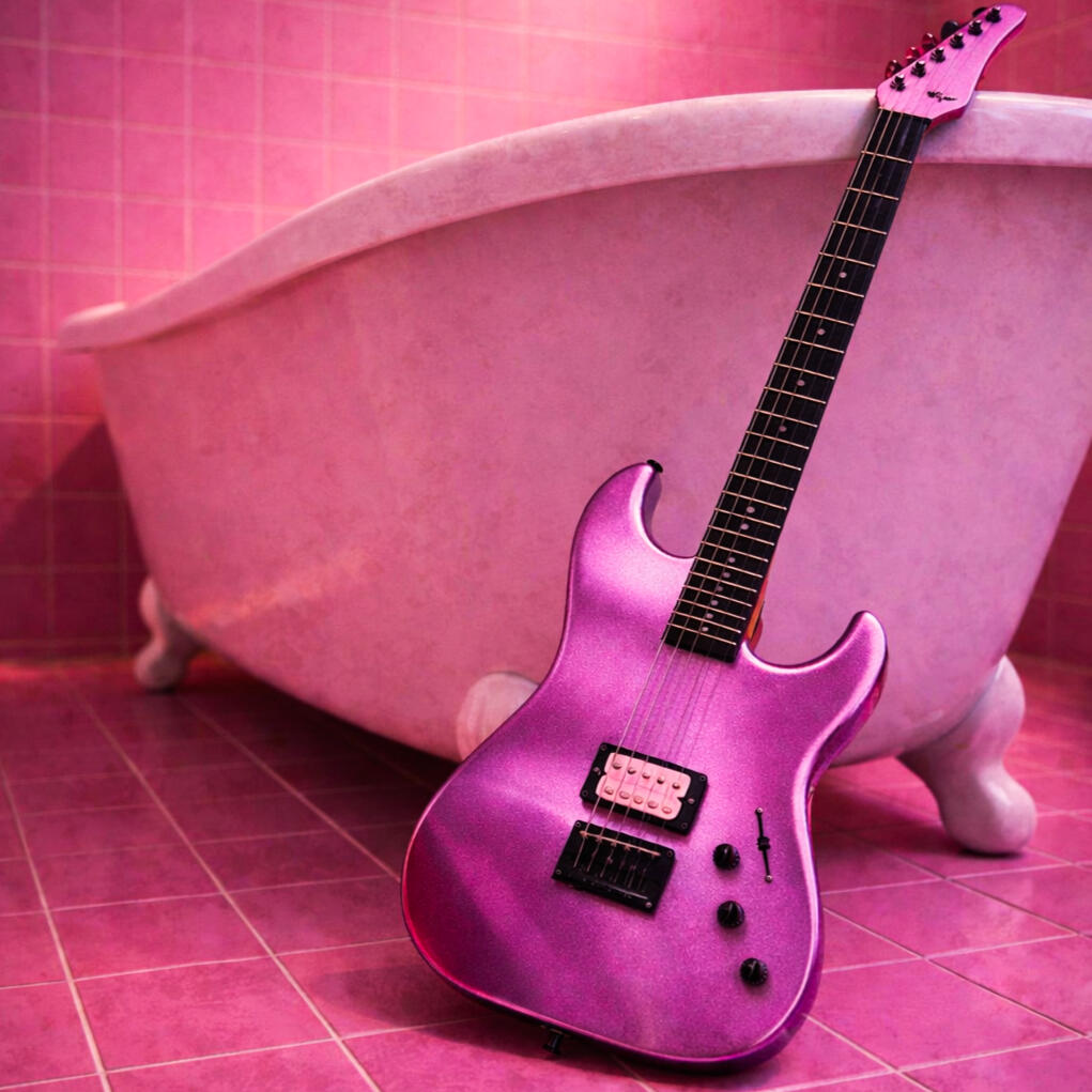
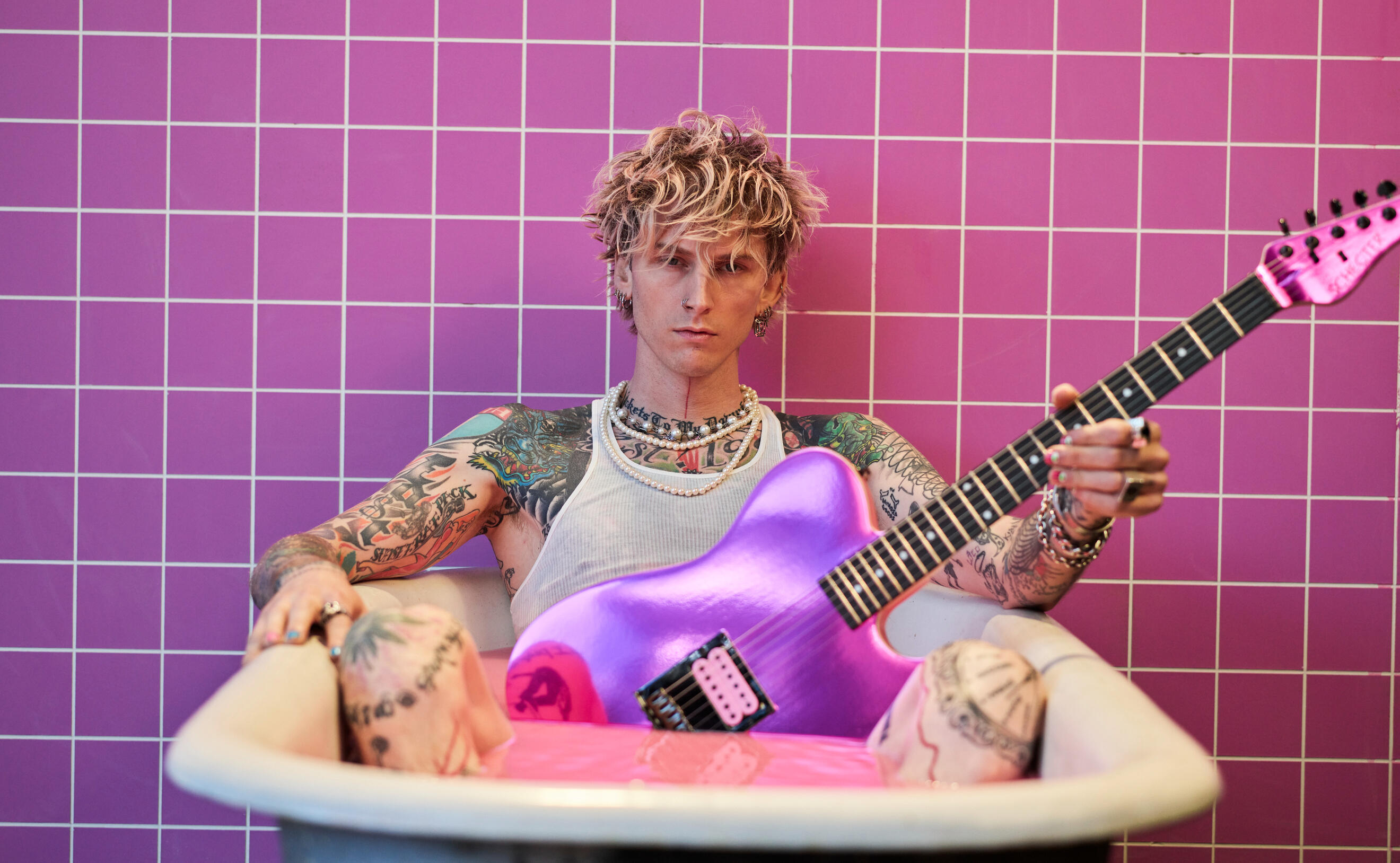
HULU
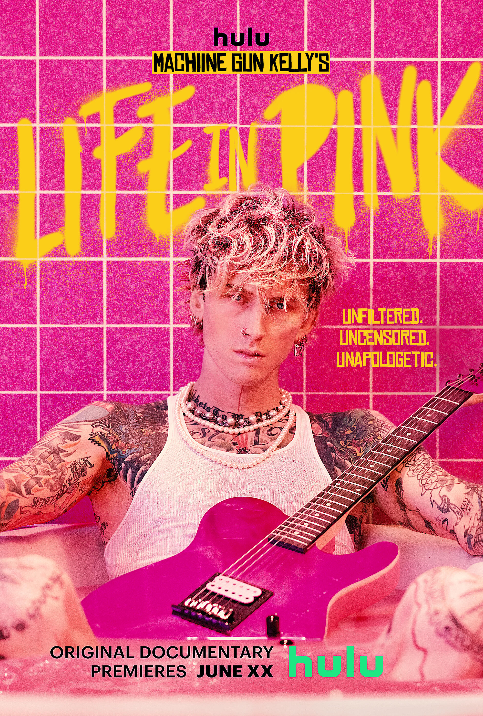
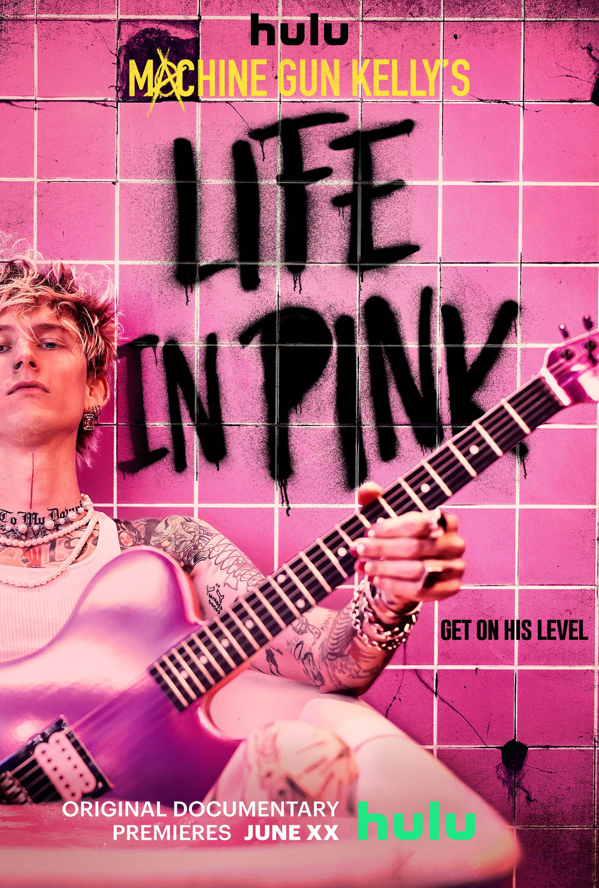
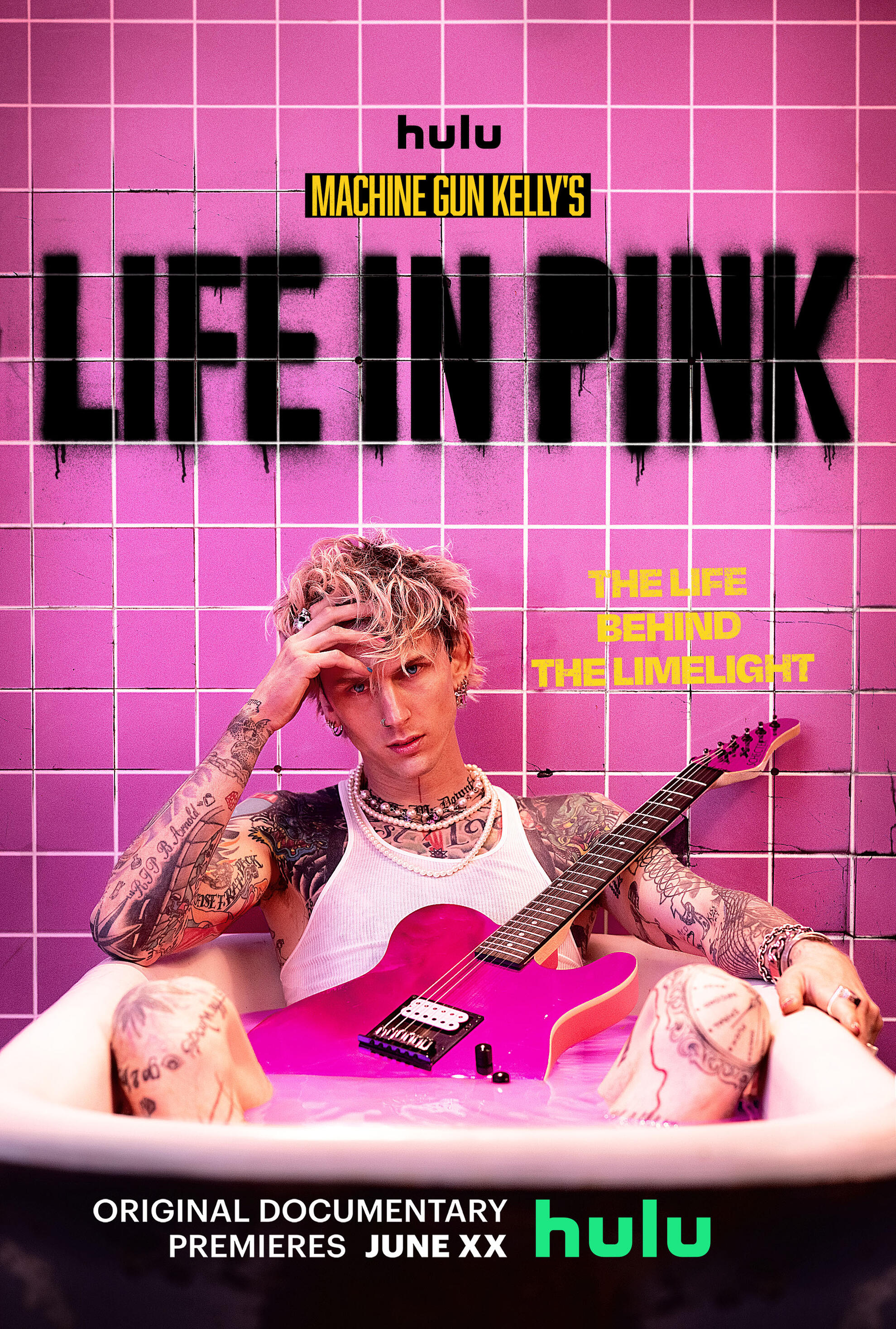
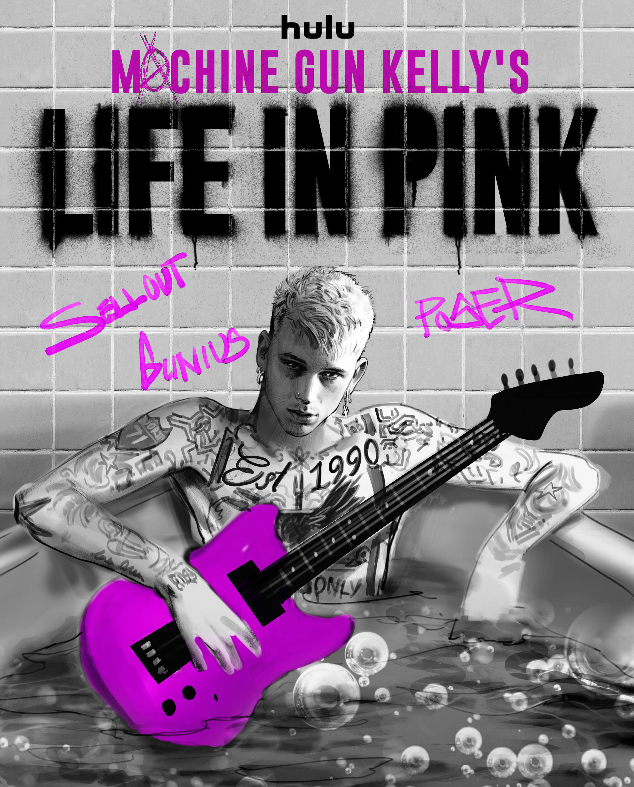
Machine Gun Kelly: Life in Pink
CAMPAIGN CREATIVE - ART DIRECTION - CONCEPT DEVELOPMENT
THE CHALLENGE
MGK's image was built on a bad-boy rapper persona. When he shifted into rock, the reaction was immediate and not always positive.The brief asked to move past that noise and show something more personal. A version that reflects the access of the film not just the persona, but the person
underneath it.
"A private moment that isn't fully private. MGK stripped down, suspended.
A suggestion of rebirth, shaped by everything that surrounds him."
THE APPROACH
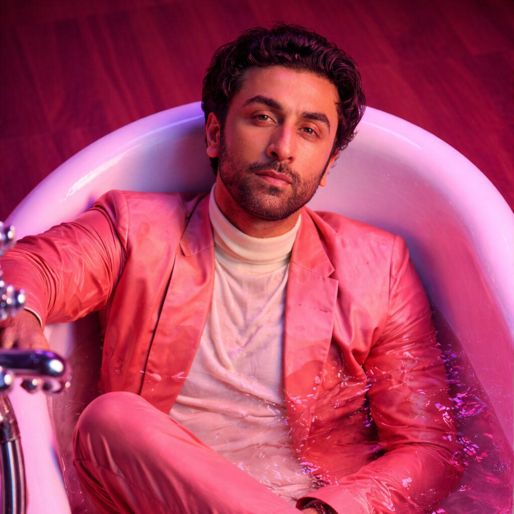
The concept: a pink bathtub.MGK, shirtless, submerged in pink water, holding an electric guitar. The bathroom is fully pink. The walls are tagged — Life in Pink spray-painted and dripping across the tile, surrounded by layers of handwritten words and tags.He's alone in the space, but not without everything that's been said about him. The writing sits around him, behind him, at eye level — constant, unavoidable.
STYLE DIRECTION - AI GENERATED REFERENCES
Visual references and style direction were developed using a combination of AI-assisted concepting tools and in-house sketching allowing for rapid exploration of lighting, color, and environmental tone before the shoot.This phase accelerated the visual decision-making process testing the pink environment at scale, exploring how the graffiti texture would read against the subject, and locking in the lighting language early.AI was used as a concepting tool. Every element in the final image was physically built and shot.
THE EXECUTION
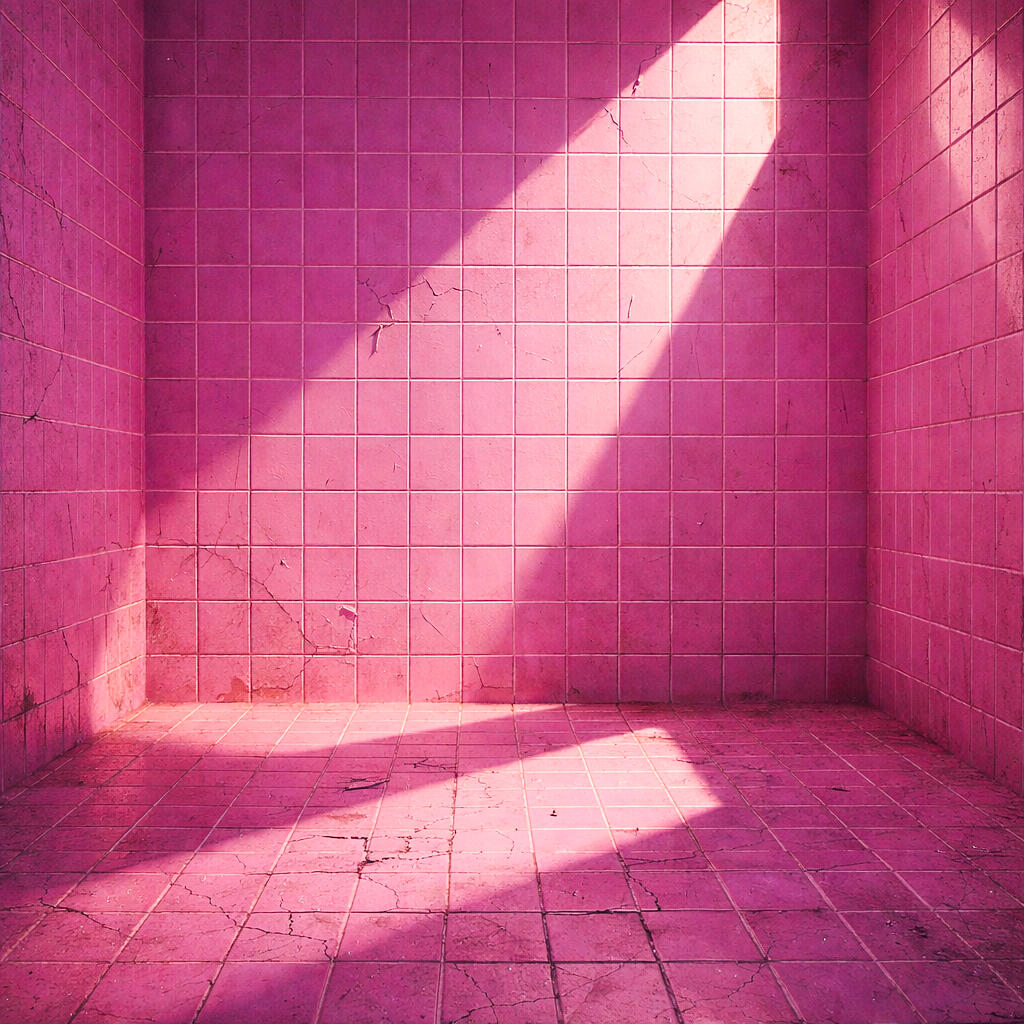
The bathroom began as a clean, tiled plate.
All graffiti was hand-written and spray-painted digitally onto the walls — built up in layers, phrases, notes, symbols, some clear, some partially obscured.The writing reflects the kind of commentary that follows him. Criticism, noise, repetition. It stays with him. It surrounds him.All composited, together making the environment feels present and raw.
THE ANIMATION
To take it a step further, I extended the concept through animation — both to show the process and to reinforce the idea of language building around him.Words layer over words, tags bleed into type, until he’s completely surrounded.
ADDITIONAL EXECUTIONS